Showing posts with label graphic art. Show all posts

Friday, 12 April 2019

A hell of a superhero romp

Boy, oh boy – the new Hellboy film has taken a critical panning. Before even reaching its first weekend, review aggregator Rotten Tomatoes had pelted it with an approval rating of just 12%, based on 97 reviews.

Surely it can’t be that bad?

Well, sure enough, it isn’t.

Let’s be clear – it isn’t Guillermo del Toro and isn’t Ron Perlman. The 2004 and 2008 films that the director and actor collaborated on are huge fun and the latter turned in a pair of iconic performances. I can’t stop smiling at the scene in the second film where lovelorn Hellboy and Abe Sapien drunkenly sing along to Barry Manilow.

But let’s also be clear – in a lot of ways, this screen reboot is actually closer to the look and feel of Mike Mignola’s original Hellboy comics – and I have loved those for years.

Here, we get the requisite origin reminder: demon baby Hellboy, summoned up by Rasputin for the Nazis in a last-ditch effort to win the war (and filmed by Leni Riefenstahl), but saved and adopted by Professor Trevor Bruttenholm, founder of The Bureau for Paranormal Research and Defense, a joint UK-US body.

The key plot here centres on an ancient sorceress, Nimue, The Blood Queen (Lady of the Lake), defeated centuries earlier by King Arthur, but now back with a vengeance and planning to wipe out humanity so that ‘monsters’ can live un-threatened in a new Eden.

No spoilers from me on the plot. But it is entirely in keeping with Mignola’s originals, which weave the modern with folklore and fairytale. Indeed, the comics were where I first learned of Baba Yaga (who crops up here too, in a seriously creepy piece of CGI work).

It’s violent – as are the comics – and indeed, the fight scenes capture the gravity-defying sense of action (and incredible composition) in Mignola’s original drawings (see left).

I’ve seen the film described as a bit all over the place, but I can’t see that. Perhaps not as tight as it could be, but it didn’t lag for me.

David Harbour as the eponymous hero seems to be feeling his way into the character: some early method mumbling doesn’t help, but by the second half of the film, when he’s getting sterling support from Sasha Lane as Alice Monaghan, a young woman with supernatural abilities, and Daniel Dae Kin as BPRD veteran Ben Daimio, he seems much more comfortable.

There’s sardonic humour, badass monsters and fight scenes aplenty, and a straight-up Mignola mash-up of folklore and mythology.

Ian McShane adds to all this as Bruttenholm, Hellboy’s daddy, while Milla Jovovich provides scary, sexy class as Nimue. 


It’s not perfect, but it’s also light years away from Marvel ands light years better than most of what DC has done in recent years. For me, as a long-time Hellboy fan, Neil Marshall’s film is a rollicking romp in the Hellboy universe and I hope we’ll see more.

After all – they can’t leave things just as the new team discovers Abe Sapien!


Tuesday, 10 January 2017

Further adventures in comic land

Atmospheric artwork from Andrew MacLean
The last part of 2016 saw plenty of action on the comic front – it’s become a serious pleasure to get regular deliveries of Forbidden Planet subscription packets through the post – and there’s been plenty to enjoy from what’s been inside.

Here’s a few notes on what I read and saw in that period.

Descender 3: Singularities by Jeff Lemire continues to be a cracking read, with this third collection playing with time to allow us to see events from different characters’ perspectives, and there’s enough meat here to keep the reader wondering what they’re not yet seeing, as the companion boy robot Tim finds himself being hunted by myriad forces – and the motives are not obvious yet.

And one of the things that Lemire achieves is to make the less sophisticated robots’ characters too, creating real pathos – light years away from the comedic approach of, say, C-3PO and R2-D2.

Panel from Descender 3
Dustin Nguyen’s art remains a real pleasure, his watercolours in a limited palette offering an unusual approach to sci-fi illustration, but one that works beautifully here, offering a soft-focus contrast to the story that nonetheless never jars.

Trees 2: Two Forests arrived a while back and takes us further into Warren Ellis’s apocalyptic tale, narrowing the field of vision to just the ‘trees’ – alien craft of some unexplained variety – in New York and the Orkney Isles, and with these, the central protagonists linked to them.

There’s a brooding darkness building here, with a sense of impending doom and even an incident in London that could be read as a pessimistic comment on the growing anti-immigrant sentiment that both contributed to Brexit and was boosted by it.

All this is helped by Jason Howard’s art, with strong images and a muted palette providing an excellent compliment to the words.

On a lighter note, I have also enjoyed a spot of Doctor Strange from Marvel – though not half as much as I enjoyed the film. Indeed, with TV watching and 2016’s cinema visits for the doctor and Deadpool, I’ve got really quite absorbed into the Marvel universe – albeit it cinematically rather than the version on paper.

"We are Groot" And the racoon's pretty cool too
Big screen trailers for spring’s Guardians of the Galaxy II looks so much fun that I caught up with the first one over Christmas – and loved it! It’s smashing entertainment.

Late as ever to such a party, I am however, now able to cry ‘We are Groot!’ with the best of them.

Then there’s the mere thought of autumn’s Thor: Ragnarok, which in promising to see Benedict Cumberbatch reprise Strange and Antony Hopkins Odin, looks set to ensure that this interest continues.

Christmas also saw me catching some Captain America for the first time – a bit straight-laced as a character, but when your support cast includes Samuel L Jackson as Nick Fury and, in Winter Soldier, Robert Redford as a senior SHIELD leader, plus the currently ubiquitous Toby Jones as a creepy, dead Nazi scientist (though not as creepy as his Jimmy Savile-alike villain Culverton Smith in last weekend’s Sherlock), then a bit of straight laciness can be coped with.

If Marvel have mastered the way to create universes from myriad characters, DC is floundering in its efforts to catch up, with last year’s Batman v Superman having been panned.

The only highlight was reputedly the brief first sight of Gal Gadot as Wonder Woman, set for her own individual movie release this summer.

Now I’ve loved Wonder Woman since the 1970s and the days of Lynda Carter, and it was one of the first things that I started reading as I dipped my toes back into the world of comics over the last few years, but DC’s 75th anniversary comic was a disappointing, disjointed mess.

Much – MUCH – better was volume 1 of Grant Morrison’s Wonder Woman: Earth One from earlier in 2016, which provided a new but coherent take on the Amazon’s origin story.

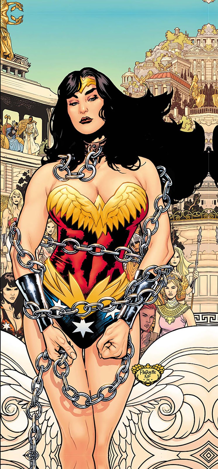
Yanick Paquette’s art worked for me – but then again, I didn’t get in a tizzy about pictures of WW in chains. Well, not that sort of a tizzy.

I really don’t know whether I’ll watch this summer’s film: setting it in WWI as opposed to Wonder Woman’s conventional entry into human affairs in WWII suggests that the filmmakers have decided that, instead of understanding that conflict as six of one and half a dozen of the others, writ large across all the main actors involved, it’s going to leap in with a howlingly simplistic Goodies v Baddies approach.

We shall see.

Normal and the head of Agatha Blue Witch
Very differently, one of my personal discoveries of the year was Andrew MacLean’s Head Lopper.

Written and drawn by MacLean – and originally self-published before being picked up by Image – this is the tale of Viking warrior Norgal, who hunts down monsters with the help (though he doesn’t actually like it) of the severed head of Agatha Blue Witch, which he carries around in a bag.

Image threw the comic convention of monthly, 22-page issues out of the window for this, instead allowing MacLean to produce bigger issues on a quarterly basis.

And while the first trade is a lot heftier a volume than you’d usually expect, it doesn’t fail on the fun quota.

Completely different to Hellboy, it would nonetheless be impossible not to see a relationship between Mike Mignola’s seminal work and this.

There’s humour, violence, great atmosphere and a wonderful sense of the folkloric – yes, all things that you’ll find in Hellboy – along with a superbly stylised visual look, all of which effectively gets the Mignola nod of approval in a contribution from the man himself in the gallery at the back of this volume.

MacLean makes storytelling look simple and his art ticks incalculable numbers of boxes. The picture I’ve used here also illustrates MacLean’s fascinating use of foreshortening and perspective, which is a contributory aspect of the work.

There is not a single thing I don’t love about this.

Black Road comes with added ravens
Not very far behind in my personal appreciation stakes comes the first trade of Black Road, which also plunges readers into Viking terrain – but the mood and look could hardly be more different.

Magnus the Black is a man placed awkwardly somewhere between paganism and Christianity, as the church militant strives to conquer the Viking lands for Christ.

Hoping to perhaps ease the trauma of this momentous change for his fellow Norse men, Black finds himself caught up in the bloody politics of religious conquest – and has to turn detective when an official in his care is brutally murdered.

Brian Wood’s story has a satisfying complexity about it, but it’s the art by Dave McCaig and Garry Brown that really lifts this, with its evocation of the bleak, vast landscape of the north.

Having enjoyed the autumn release of the first trade, I’ve hit the subscribe button for the coming issues in this Image series, rather than wait for trade two.

Actually, that’s also an indicator that I’m getting sussed enough about the comics world that I spotted it before the new arc begins.

In the meantime, Skottie Young’s I Hate Fairyland is another comic that defies easy categorisation.

A bright, bubbly tot called Gertrude wishes to live in Fairyland – and then her wish comes true.

Gertrude is not as happy as Larry. Neither is Larry, to be fair
Unfortunately, 20 years later, she’s grown mentally but is physically still a child, trapped in a bubblegum world of sugary niceness.

A crazy new take on a sort of Dorothy longing for Kansas, Gertrude has become a sweary, psychopathic monster who wants to destroy everything and everyone as she tries to find an escape back to reality, accompanied by Larry, a cynical version of Jiminy Cricket.

Life is further complicated when the queen of Fairyland decides that the only way in which to deal with the chaos and violence is to have Gertrude herself killed.

Written and illustrated by Young, volume one was fun and the second trade is out now (if you look online at Forbidden Planet, it can currently be obtained with a very nice autographed postcard too).

It’s hard to know where Young can take this story – but fluff you (as our less-than-angelic Gertude so often puts it): it’s going to be fun finding out.

And finally, the autumn also saw my own first comic strip – okay, only three pages, but my words and my illustrations. It was published in a membership magazine that went to over a million people, but I've now put up a digital version, so you can catch it here. Enjoy!


Sunday, 9 October 2016

Death's vengeful daughter, alien invasion, over-reaching geniuses and uncensored Judge Dredd

The last few weeks have seen my comics enjoyment – and involvement – broadening and moving beyond the realms of simply being a reader.

But for this post, I’m going to stick with what I’ve been reading and begin in mid September, when The Other Half was away on a brief Rugby League trip and I leapt at the opportunity to visit Gosh! comics in Soho, where staff took the time to recommend a number of titles for me to try.

The first of these that I have read thus far is volume one of Pretty Deadly, a quirky fusion of westerns, folklore and fantasy by Kelly Sue DeConnick, centred on Death’s daughter and a bitter, savage search for vengeance.

Within this, we get a sense of something ancient and timeless in the power of stories.

The excellent, stylised artwork by Emma Ríos adds to the strange and magical quality of the story, with a fascinating palette that includes, almost as an act of artistic irony given the storyline, pale pastels.

To give you an idea of just how weird this is, each chapter is introduced by the ‘living’ skeleton of a dead rabbit talking to a butterfly. And yet somehow it all works, ensuring an immediate order being placed for the second instalment.

Next up was Y: The Last Man, Brian K Vaughan’s story of Yorick and his capuchin monkey, who find themselves as the last males on Earth when an unknown plague wipes out all other males – and with an awful lot of women wanting them dead too.

Vaughan is a bright new(ish) star of the comics scene, but it took me an age to get going with this and, with the flatness of Pia Guerra’s artwork, I’m not sure whether I’ll follow the story on to a further volume.

By contrast, the first Wild’s End trade knocked my metaphorical socks off.

Dan Abnett’s tale unfolds in and around a peaceful 1930s English village populated by a cast of anthropomorphic animal citizens, who suddenly find their rural idyll shattered by an alien invasion.

This is Wind in the Willows fused with War of the Worlds – with a dry humour underlying the whole and a very clever invocation of a semi-mythical England, from character names such as Captain Wainmaring to two pages of a delightfully realised travel guide that nods to the likes of Wainwright, Bradshaw and Pevsner.

INJ Culbard’s art is a joy. Deceptively simple, it absolutely pings off the page in vibrant colour. And the space ships are Deco lights!

Wild’s End is funny, violent, with a fast-paced story and strong characters – it’s an absolute delight. Whether I will be reading more of this is not even a real question.

The doormat at home is just beginning to get used to Forbidden Planet subscription packets landing on it.

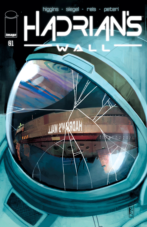
But when the first issue of Hadrian’s Wall descended, it left me with the giddy delight of having my first ever subscribed-before-the-start-of-a-completely-new-comic experience – and that was before I’d even turned the first page.

Once I had read it, my pleasure was increased.

Set some time in the future, it sees pill-popping detective Simon Moore sent to solve an unexplained death on board the space station Hadrian’s Wall, where his ex-wife wants to avoid any trouble.

To be strictly accurate, the death doesn’t take place on board anything, but in space. Which makes this less a locked-room mystery and more an open-space one.

With a story by Kyle Higgins and Alec Siegel, and art by Rod Reis, it’s also further evidence that you can hit the ground running a new series.

Talking of comics that are slow to get going, Injection fell into this category. Volume one was confusing – yet also intriguing and well-illustrated enough that I pre-ordered the second trade.

Indeed, I actually went back and re-read one before starting two – and now it’s all coming together.

The central premise is that five geniuses have ‘poisoned’ the 21st century in an effort to drive innovation and growth and avoid stagnation. But ion course things have got out of hand and now they need to put things right. Which isn’t going to be easy.

In the second trade, everything tightens and, in particular, the concentration on one of the five, consulting detective Vivek Headland, works wonders for drawing the reader further in.

Warren Ellis’s storey is intriguing and the artwork, from Declan Shelvey and Jordie Bellarie, helps create a dark, brooding feel.

Also on the recent reading list was Judge Dredd: The Cursed Earth Uncensored.

Over the years, I’ve picked up the odd copy of 2000AD, but never really been able to get into it.

This, on the other hand, made it easy. The “uncensored” was what drew my attention to it in the first place – chunks had been removed from the original 1978 story because it used the McDonalds, Burger King and Jolly Green Giant trademarks, without asking permission.

And as they showed at the time, those companies are not exactly averse to litigation.

Fast forward to 2014, when the EU introduced a new directive stating that the use of copyright-protected characters for parody was not banned. Thus in June this year, we got the publication of the entire Cursed Earth storyline in a stunningly nice hardback version.

Written by Pat Mills, John Wagner and Chris Lowder, with classic black line art by Mick NcMahon and Brian Bolland, plus a smattering of colour spreads, it’s a fun romp and a perfect intro to the Judge if, like me, you’ve only really dipped in before.

So, that’s a little round-up on recent reading – coming soon: beyond the reading.


Wednesday, 23 December 2015

Graphic genius: Escher at the Dulwich Picture Gallery

House of Stairs
Now don’t get me wrong: regenerating 10 derelict houses is A Good Thing – but come on, is it really art?

That is the question triggered by the announcement a few weeks ago that this year’s Turner Prize has been awarded to Assemble, an architecture and design collective, for its work on derelict properties in Toxteth, Liverpool.

Of course, if you can label a ‘supernatural study centre, which screens interviews with people who claim to have had paranormal activities as ‘art’, then perhaps it is.

If you can use ‘art’ to describe an avant-garde, a cappella 24-minute opera (rather than ‘music’ or ‘opera’), then that regeneration might well qualify as art.

Yet it is indicative of the mess that art is in these days – not least in the UK – and of the just how far up it’s own fundament that the art establishment is, that it still treats with disdain anything that might be a bit ‘graphic’ – and that’s not ‘graphic’ in the sexual sense.

All of which brings us to what is one of the best exhibitions to be seen on these shores this year, having first been seen at the Scottish National Gallery of Modern Art and now at the Dulwich Picture Gallery.

Ascending and Descending
The Amazing World of MC Escher is the first major UK retrospective – even more incredible when you consider that there us only example of his work on display in a UK gallery (Day and Night at the Hunterian in Glasgow).

Maurits Cornelis Escher was born in Leeuwarden in the Netherlands in 1898. A sickly child, he failed his final exams – except for maths – and went to study architecture at the School for Architecture and Decorative Arts in Haarlem, before he was talent-spotted by the head of the graphic art section and hauled across to that discipline.

If his name isn’t on the tip of everyone’s tongue, millions are familiar with his work – particularly the illusory pieces that feature, for instance, impossible staircases.

Adored by mathematicians and hippies alike, he remains suspect for the art establishment – doubtless not least because he was a graphic artist.

And in an era when UK art schools no longer even bother to teach drawing, his dazzling skills as a draughtsman could be viewed as unfashionable for those who might prefer to pretend to enjoy turgid filmed rants or photographs of ancient vases being vandalised.

The works are even more extraordinary when you realise that many of them are prints – and as someone who has done a teensy weensy bit of printing this year, the level of complexity and detail proved almost mind blowing.

Reptiles
The most famous works are here: the illusions of impossible buildings include Ascending and Descending, a lithograph from 1960, which was one of the first of Escher’s works that I became aware of – if memory serves me correctly, via a feature on Blue Peter.

These works also include House of Stairs, a 1951 lithograph, with its rather delightful little ‘curl-ups’ trundling up and down and around.

And there are also pieces that demonstrate Escher’s fascinating with representing flat and three-dimensional objects, as with the little Reptiles (1943) that crawl out of the paper and become ‘real’ before crawling back into the paper, while Drawing Hands (1948) is another dazzling example of that same fascination.

You can quite easily get lost in 1938’s iconic Day and Night, which incorporates Escher’s famous tessellations – a technique inspired by studying Islamic geometric patterns during a trip to Alhambra in Granada.

Day and Night
The tessellation-based lithograph, Encounter, from 1944 has something about it that evokes Dante – a point that may (or may not) be related to its being produced during WWII.

And of the tessellations, Metamorphosis II, a woodcut from 1939, takes us on an extraordinary graphic journey of transformation – here, taking up one wall of the exhibition rooms.

The statistics are incredible. This print measures 19.2 by 389.5 cm and was printed from 20 blocks on 3 combined sheets.

A similar, but much larger version – Metamorphosis III – of this adorned the post office on the Kerkplein in the Hague, made in 1967-8 as a commission. It was moved to a new home at Schipol Airport in 2008.

Still Life and Street
But as with all the works on display in Dulwich, here you have a supperb opportunity to get really close up to them to be able to revel in the detail.

Eye, with its reflected human skull, is one of his eight mezzotints and has wonderful Manet-like blacks – evidence (were it required) of Escher’s mastery of more than one print-making technique.

But there are plenty of less-familiar works here too.

For me, one of his earliest works, the woodcut Bonifacio (1928) created after visiting Corsica, is just astonishing – not least for the extraordinary variety of marks that he used.

Still Life and Street, a woodcut from 1937, is one of those deceptive pieces that it takes a moment to realise are impossible.

Bonifacio
For all the surreal nature of much of Escher’s work, he was not attached to Surrealism and doesn’t seem to have known or communicated with any of the Surrealists artists.

For all that his work appealed to the likes of hippies and the Flower Power generation, he refused a commission for Rolling Stones cover after Mick Jagger made the mistake of writing to him by his first name.

A quiet man, he was far more interested in corresponding with mathematicians, Harold Coxeter and Roger Penrose.

But that’s not to say that his works are po-faced. They’re often playful and full of irony. And they remain technically astonishing.

A relatively small exhibition by the standards of the vast blockbusters found in central London galleries in recent years, it nonetheless takes plenty of time to view – simply because you need the time to concentrate and digest.

But if the art establishment continues to turn up its nose, then that should not stop us relishing just what a fabulous artist Escher was and just what a magnificent legacy he leaves – and as an example of just what graphic art can mean.

The Amazing World of MC Escher is at the Dulwich Picture Gallery until 17 January. Find out more at dulwichpicturegallery.org.uk.