 |
| The Melancholy of Departure |
The
weekend’s visit to the Tate Modern for the Paul Klee exhibition also included a
wander around the rest of the gallery.
We’d
planned well: arriving for around 10.30am after a pleasant walk over the
Millennium Bridge on a bright, fresh winter morning.
The
plan was to see the Klee first and then have lunch.
It’s
worth noting that the gallery’s café is far from the most expensive eatery
around and we enjoyed fish and chips – and very good battered fish it was too – with dandelion and
burdock, leaving me feeling really rather Famous Fiveish.
And we were lucky enough to sit by a window that gave us a wonderful view beyond bare but
lithe silver birches, over the river and to the dome of St Paul’s in the
brittle December sunlight.
It’s
a vast gallery and you’re never going to seriously see it all in
one go, but
I’d done my homework and picked two of the permanent collections to look at.
 |
| Spanish Landscape with Mountains |
Once
fed and refreshed, first up was the Poetry and Dream section, because it
promised Picasso, Dalí and de Chirico.
Only
recently had I put the latter’s name to paintings we were shown during A’ level
art: I remembered the perspective of his metaphysical pictures and this was the
first chance to actually see any.
 |
| Metamorphosis of Narcissus |
The
Uncertainty of the Poet (1913), at the entrance to this part of the collection,
was crowded. It was easier to view The Melancholy of Departure (1916) later in the displays,
although being hung high up doesn’t give you much chance to really look at the
brushwork, for instance.
Fortunately,
Dalí’s Metamorphosis of Narcissus (1937) was better positioned.
I’d
not seen any Dalí in ‘the flesh’ before: this is one of his iconic images and
is technically stunning – painted before he got so full of himself that he
ceased to be bothered with anything beyond promotion of himself as his main
work.
 |
| Head of a Woman (Fernande) |
Autumnal
Cannibalism (1936) and Mountain Lake (1938), although less well known
and less vibrantly colourful, are also fascinating canvases.
There
was no shortage of Picasso here: including Weeping Woman from 1937 and The Three
Dancers from 1925, for which Will Gompertz provides an excellent description in
What Are You Looking At?
One
of the smaller rooms had three Picasso nudes of varying styles, plus a small
sculpture by Matisse – fascinating contrasts.
There
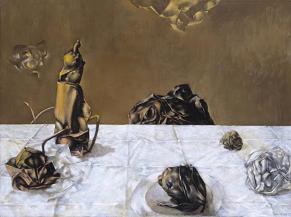
was plenty that was entirely new to me, though: Dorothea Tanning’s work is
fascinating – Some Roses and Their Phantoms (1952) is just one example that caught the eye of both of us.
Paul
Nash’s Landscape from a Dream (1936-38) was an interesting companion to Landscape of the Moon’s Last Phase that I’d seen at Liverpool’s Walker Gallery last month.
 |
| Self-Portrait |
And
then there was Max Ernst. I knew the name, but Celebes (1921) and Forest
and Dove
(1927) are wonderful examples of the fantastical – the latter again reminding
the viewer of the place of the forest in German culture.
We’d
been lucky with the Klee exhibition not being very busy, but these galleries
were rammed.
Other
paintings of particular interest included Christian Schad’s Self-Portrait from
1927, which has an Otto Dix-like woman in the background, while the face and
expression reminded me very much of those by Albert Aereboe that I’d seen in
the Museum Behnhaus Drägerhaus in Lübeck in April.
Dora
Carrington’s Spanish Landscape with Mountains (c1924) is another painting you
can get lost in, and which seems to float somewhere between the real and the
imagined.
And in a similar vein, I
was also taken with The Invisibles (1951) by Yves Tanguy – a painting
that hovers between the abstract and some sort of alternate, sci-fi reality
that you feel yourself nearly but not quite ‘seeing’.
 |
| Portrait of Greta Moll |
There
were works by Duchamps, some Giacometti, some Man Ray, some Miró and some Joseph
Beuys too – and again, the Gompertz book helped when looking at some of these, even if they were not always things that excited me the most.
But it was with real delight that we walked into one room to see Portrait of Greta Moll (1908) by Matisse – so
that’s why it’s not on display in the National Gallery; it’s on loan at the South Bank!
With some energy left, we pottered up to Structure and Clarity on the fourth floor, which was nowhere near as heavily populated – possibly because this was where things got rather less
figurative and much more ‘modern’
I
wanted to see the Cubist works – not least, those by Georges Braque, simply
because I’d not seen any by him in the ‘flesh’. They don’t bowl me over, even though I understand what the Cubists were trying to do, but it was good to actually see some.
 |
| Composition C (NoIII) with Red, Yellow and Blue |
At this point there was also more works by Picasso, illustrating yet again his incredible range of styles.
The
sculpture, Head of a Woman (Fernande), 1909, particularly caught the
eye.
The
gallery also offers the chance to see some Piet Mondrian, including Composition
C (No III) with Red, Yellow and Blue (1935), and Kandinsky’s Swinging (1925).
Like the Klee earlier in the day, the Mondrain had layers to it, as the artist himself had mounted and framed his work, often giving it a sort of added depth in the choice of mounting.
Gompertz argues that however simple you might consider Mondrain’s iconic geometric paintings, they have a great democracy about them – they appear on all sorts of everyday objects, from bags to phone covers. It’s art for everyone and for every day, as promoted by Bauhaus and back to William Morris.
 |
| Pierced Hemisphere II |
In the same area of the gallery was to be seen Dan Flavin’s ‘Monument’ for V Tatlin’ – which was one a series of four
neon installations with the same name, and which date from 1966-69.
We
were getting seriously into the realms of the minimal, which is where I’d point
out that
On
the other hand – and thanks in part to Gompertz who discusses it in his book – I actually liked Donald
Judd’s untitled open metal box from 1972 – although the line around it that
marks the perimeter over which you’re not supposed to step does not take into
account short arses like me.
 |
| Study for Homage to the Square |
The texture and the colour of it, however, are warming and
pleasant, and actually seem contrary to conventional, cold minimalism of many other works.
The gallery also displays Henry Moore’s rather sensual Composition from 1932 – The Other
Half gets excited over Moore because he were a Castleford lad too – and a number of
works by Wakefield’s own Barbara Hepworth, including Pierced Hemisphere II (1937-38).
And
going for the really abstract and the minimal, I liked the colours of Joseph
Albers’s Study for Homage to the Square (1964) and the sheer simplicity of
Ellsworth Kelly’s Black Square with Blue (1970).
 |
| Untitled |
In fact, the more that I look and explore, the more I realise that I’m fascinated by colour in a way that is very recent – or at least the conscious interest is.
Gompertz’s
book has made a huge difference to helping my somewhat more opened mind
actually understand what I’m looking at – I’ve recommended it before and will
happily do so again.
The
visit also offered a great opportunity to – in effect – put into practice what
I’d read, and try to approach very modern works from a different perspective.
 |
| Some Roses and their Phantoms |
Such
a visit also adds to an understanding that, contrary to what might be a popular
belief, there have been plenty of quality female artists around and rather more
British ones (of both sexes) than one might realise.
The
former was something that struck me when visiting the Walker Gallery. It had
also cropped up during the Royal Academy’s Manet exhibition in the spring,
which introduced me to Berthe Morisot – and I later saw work by her in the
National Gallery.
Waiting
for a bus later, as dusk reclaimed London, we both looked forward to a nice cup of tea – but the effort felt like it had been well worth
the effort.


.jpg)