Showing posts with label Will Gompertz. Show all posts

Friday, 14 February 2014

Laughing all the way to the bank

Valium, by Damien Hirst

People seem to have been getting into a grand old funk over Damien Hirst’s claim that he copies his children’s paintings and drawings.

Well, this was certainly the case at the Observer and at the Telegraph, in response to Hirst’s claim in an interview with the former.

At the Obs, the whinging was mostly about his being ‘a corporate whore’, while over at the Telegraph, comments concentrated on most of his own art resembling the contents of used nappies.

Don’t you just lurve reasoned debate?

As Will Gompertz explained at some length in What Are You Looking At? that no, your five-year-old could not have produced even the works of modern art that you find utterly incomprehensible.

You might think that a Mondrian, for instance, is simple or that Pollock simply dripped, but actually executing such a piece is a damned sight harder than many imagine.

Now to be quite clear, I’m not personally a fan of Hirst’s work, but he’s clever – not least in being able to exploit the market for whatever is deemed to be ‘hip’ and ‘trendy’ art among those who have more money than sense.

It was all encouraged in the halcyon days of the 1980s by the dear old Saatchis, who set out to prescribe what was cool – and, most importantly, to profit from it.

These are the same Saatchis who now routinely use Facebook to tell people that they can suggest new artists whose work would be worth investing in.

Buy them and the price will go up, of course, as they then become collectible. And the Saatchis will themselves make plenty of money from you taking their advice.

Oddly, none of the painters currently being touted by them seem to have chosen to represent a man appearing to throttle his wife.

But there’s an element of the emperor’s new clothes in all this: I’ve little doubt that, as he’s laughing all the way to the bank, Hirst is also laughing at those who pay millions for a piece that someone in his studio has produced to his instructions – based on something his children did, if we’re to believe his somewhat faux humility.

Indeed, never mind that fairytale – there’s always the classic modern art story of Marcel Duchamp and his urinal, a piece of ‘made’ art that was used entirely to extract the piss out of a group of self-appointed arbiters of what was and was not art – and in the process, itself became iconic and labelled ‘art’.

This is not a real Lowry
In the past, it would be the patron – often the church – who, in effect, made such decisions, but that has broadened out over the years, helped by, among other things, public galleries and exhibitions and also increasing numbers of people with disposable incomes and a desire to decorate their homes.

Mind, the likes of Hirst are not the only ones taking the proverbial out of people.

In a prime example of fools and cash being easily parted, the Facebook page for LS Lowry warned against a spate of fakes that are being sold on eBay.

They highlighted one in particular, which was secured with a bid of £670. Let’s allow for someone being a bit taken in by the background, but the figure? And just look at that face!

Beyond that, look at the signature – and it’s easy enough to Google the authentic signature. That’s not close.

Away from cyberspace, the Telegraph reported on 82-year-old Bill Harbord, a London man who has been selling fakes for years – although at rather lower prices.

It’s difficult to feel particularly sorry for anyone all those who have bought a picture from Mr Harbord. Honestly – be sensible: it’s really not very unlikely that you'll find a genuine Raoul Dufy painting for £250.

Actually, it’s tempting to laugh in much the same way you’ll possibly laugh at those who spend hundreds of thousands on a Damien Hirst because they’ve been told it’s good.

If you’re going to buy art by a well-known figure, make sure you know who you’re buying it from – a gallery will be a safer bet, for instance – and accustom yourself with the artist in question’s work, signature, any numbering system etc.

It’s not difficult – and it’s not rocket science.

If you do want to feel for someone, though, spare a thought for Martin Lang, who spent £100,000 on what he thought was an original Chagall.

Searching for authentification, it was sent to the Chagall Committee in Paris, which decided it was a fake and that it should thus be destroyed under French law.

Mr Lang wants it back – he’s still waiting to see if they’ll mark at as a forgery and send it back to him.


Tuesday, 31 December 2013

From the metaphysical to a shiny metal box


The Melancholy of Departure
The weekend’s visit to the Tate Modern for the Paul Klee exhibition also included a wander around the rest of the gallery.

We’d planned well: arriving for around 10.30am after a pleasant walk over the Millennium Bridge on a bright, fresh winter morning.

The plan was to see the Klee first and then have lunch.

It’s worth noting that the gallery’s café is far from the most expensive eatery around and we enjoyed fish and chips – and very good battered fish it was too – with dandelion and burdock, leaving me feeling really rather Famous Fiveish.

And we were lucky enough to sit by a window that gave us a wonderful view beyond bare but lithe silver birches, over the river and to the dome of St Paul’s in the brittle December sunlight.

It’s a vast gallery and you’re never going to seriously see it all in
Spanish Landscape with Mountains
one go, but I’d done my homework and picked two of the permanent collections to look at.

Once fed and refreshed, first up was the Poetry and Dream section, because it promised Picasso, Dalí and de Chirico.

Only recently had I put the latter’s name to paintings we were shown during A’ level art: I remembered the perspective of his metaphysical pictures and this was the first chance to actually see any.

Metamorphosis of Narcissus
The Uncertainty of the Poet (1913), at the entrance to this part of the collection, was crowded. It was easier to view The Melancholy of Departure (1916) later in the displays, although being hung high up doesn’t give you much chance to really look at the brushwork, for instance.

Fortunately, Dalí’s Metamorphosis of Narcissus (1937) was better positioned.

I’d not seen any Dalí in ‘the flesh’ before: this is one of his iconic images and is technically stunning – painted before he got so full of himself that he ceased to be bothered with anything beyond promotion of himself as his main work.

Head of a Woman (Fernande)
Autumnal Cannibalism (1936) and Mountain Lake (1938), although less well known and less vibrantly colourful, are also fascinating canvases.

There was no shortage of Picasso here: including Weeping Woman from 1937 and The Three Dancers from 1925, for which Will Gompertz provides an excellent description in What Are You Looking At?

One of the smaller rooms had three Picasso nudes of varying styles, plus a small sculpture by Matisse – fascinating contrasts.

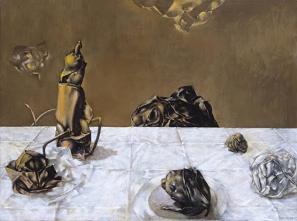
There was plenty that was entirely new to me, though: Dorothea Tanning’s work is fascinating – Some Roses and Their Phantoms (1952) is just one example that caught the eye of both of us.

Paul Nash’s Landscape from a Dream (1936-38) was an interesting companion to Landscape of the Moon’s Last Phase that I’d seen at Liverpool’s Walker Gallery last month.

Self-Portrait
And then there was Max Ernst. I knew the name, but Celebes (1921) and Forest and Dove (1927) are wonderful examples of the fantastical – the latter again reminding the viewer of the place of the forest in German culture.

We’d been lucky with the Klee exhibition not being very busy, but these galleries were rammed.

Other paintings of particular interest included Christian Schad’s Self-Portrait from 1927, which has an Otto Dix-like woman in the background, while the face and expression reminded me very much of those by Albert Aereboe that I’d seen in the Museum Behnhaus Drägerhaus in Lübeck in April.

Dora Carrington’s Spanish Landscape with Mountains (c1924) is another painting you can get lost in, and which seems to float somewhere between the real and the imagined.

And in a similar vein, I was also taken with The Invisibles (1951) by Yves Tanguy – a painting that hovers between the abstract and some sort of alternate, sci-fi reality that you feel yourself nearly but not quite ‘seeing’.

Portrait of Greta Moll
There were works by Duchamps, some Giacometti, some Man Ray, some Miró and some Joseph Beuys too – and again, the Gompertz book helped when looking at some of these, even if they were not always things that excited me the most.

But it was with real delight that we walked into one room to see Portrait of Greta Moll (1908) by Matisse – so that’s why it’s not on display in the National Gallery; its on loan at the South Bank!

With some energy left, we pottered up to Structure and Clarity on the fourth floor, which was nowhere near as heavily populated – possibly because this was where things got rather less figurative and much more ‘modern’
in the way that some people mean when theyre not being very complimentary.

I wanted to see the Cubist works – not least, those by Georges Braque, simply because I’d not seen any by him in the ‘flesh’. They dont bowl me over, even though I understand what the Cubists were trying to do, but it was good to actually see some.

Composition C (NoIII) with Red, Yellow and Blue
At this point there was also more works by Picasso, illustrating yet again his incredible range of styles.

The sculpture, Head of a Woman (Fernande), 1909, particularly caught the eye.

The gallery also offers the chance to see some Piet Mondrian, including Composition C (No III) with Red, Yellow and Blue (1935), and Kandinsky’s Swinging (1925).

Like the Klee earlier in the day, the Mondrain had layers to it, as the artist himself had mounted and framed his work, often giving it a sort of added depth in the choice of mounting.

Gompertz argues that however simple you might consider Mondrain’s iconic geometric paintings, they have a great democracy about them – they appear on all sorts of everyday objects, from bags to phone covers. Its art for everyone and for every day, as promoted by Bauhaus and back to William Morris.

Pierced Hemisphere II
In the same area of the gallery was to be seen Dan Flavin’s ‘Monument’ for V Tatlin’ – which was one a series of four neon installations with the same name, and which date from 1966-69.

We were getting seriously into the realms of the minimal, which is where I’d point out that
Gerhard Richter’s comment on Grey (1974), that the subject of his painting “is the epitome of non-statement” ... “it does not trigger off feelings or associations, it is actually neither visible nor invisible ... Like no other colour it is suitable for illustrating ‘nothing’,” did take me well beyond Gompertz levels of understanding and into the terrain of ‘what pretentious twaddle’.

On the other hand – and thanks in part to Gompertz who discusses it in his book – I actually liked Donald Judd’s untitled open metal box from 1972 – although the line around it that marks the perimeter over which you’re not supposed to step does not take into account short arses like me.

Study for Homage to the Square
The texture and the colour of it, however, are warming and pleasant, and actually seem contrary to conventional, cold minimalism of many other works.

The gallery also displays Henry Moore’s rather sensual Composition from 1932 – The Other Half gets excited over Moore because he were a Castleford lad too – and a number of works by Wakefield’s own Barbara Hepworth, including Pierced Hemisphere II (1937-38).

And going for the really abstract and the minimal, I liked the colours of Joseph Albers’s Study for Homage to the Square (1964) and the sheer simplicity of Ellsworth Kelly’s Black Square with Blue (1970).

Untitled
In fact, the more that I look and explore, the more I realise that I’m fascinated by colour in a way that is very recent – or at least the conscious interest is.

Gompertz’s book has made a huge difference to helping my somewhat more opened mind actually understand what I’m looking at – I’ve recommended it before and will happily do so again.

The visit also offered a great opportunity to – in effect – put into practice what I’d read, and try to approach very modern works from a different perspective.

Some Roses and their Phantoms
Such a visit also adds to an understanding that, contrary to what might be a popular belief, there have been plenty of quality female artists around and rather more British ones (of both sexes) than one might realise.

The former was something that struck me when visiting the Walker Gallery. It had also cropped up during the Royal Academy’s Manet exhibition in the spring, which introduced me to Berthe Morisot – and I later saw work by her in the National Gallery.

Waiting for a bus later, as dusk reclaimed London, we both looked forward to a nice cup of tea – but the effort felt like it had been well worth the effort.


Wednesday, 27 November 2013

Another chance to examine the modern


Landscape of the Moon's Last Phase, Paul Nash
In between work commitments in Liverpool at the weekend, there was enough time to pop into two of the city’s galleries for an injection of art.

First up was the Walker Gallery, which is currently hosting a small exhibition of early work by David Hockney alongside its permanent collections.

Those collections include some real gems – my own highlights were a vast portrait of Henry VIII from the studio of Hans Holbein, The Viaduct at Arcueil (1898-1900), which is a very early Matisse, and Interior at Paddington (1950-51) by Lucian Freud.

Then there was Landscape of the Moon’s Last Phase (1944) by Paul Nash, which has a really haunting quality, Rembrandt’s Self-portrait as a young man (1629-31) and St John the Evangelist (about 1610-1614) by El Greco.

St John the Evangelist, El Greco
The latter is, I think, the first El Greco I’ve really looked at, and what strikes you so strongly is the modernity of it.

Cézanne’s The Murder (1867-68) was fascinating – like the Matisse, it was an early work and offers you a fresh perspective on the later, more famous paintings.

We’ll skate over the Pre-Raphelites as rapidly as I scooted past them: technically brilliant, but mawkish and overly fond of pictures of dying or dead women.

On the other hand, the gallery has a particularly large collection of modern art – partly because of links with the John Moores art prize.

On the train up north, I’d finished reading Will Gompertz’s What Are You Looking At?, a history of modern art from the 19th century right up to Banksy.

It’s an excellent read – chatty and witty, and making some complex ideas seem really simple.

Interior at Paddington, Lucian Freud
And the Walker offered the opportunity to look at some modern works against the background of what I’d learned from that book.

A fair amount of modern art is, in essence, patterns, geometric or otherwise. Generally, I find these quite easy to view – what was interesting was later noting the piece on the wall in my hotel room: simple stripes, but pleasing and soothing sea greens, with just two pencil thin stripes of a gentle pink.

In using stripes, it reminded me of a Bridget Riley I’d seen in the Walker, which used apparently simple stripes to convey something quite different – in that case, a sense of optical illusion.

Gompertz says, 'no, modern art is not art that your five-year-old could do. And that is a pretty good illustration of just why.

Some of the exhibits still left me rather cold and/or bemused – a collection of step ladders from Yoko Ono is just one example.

But there are other works that I liked very much.

Mirage, Michael Raedecker
Mirage by Michael Raedecker, for instance, won the John Moores in 1999. Raedecker incorporates different materials in his works, such as thread where you might otherwise expect paint.

This is a piece that draws you into to a fascinating landscape that seems to hark back slightly to Dalí, but without the figures.

Emin's Bed, The Little Artists
I really liked Automobilia (1972-73) by Peter Phillips, which is a collage of super-real details of various classic cars – and I have long been a sucker for the gloss and superb technique of super realism.

And then there was the Lego version of Emin’s Bed by The Little Artists, John Cake and Darren Neave, which isn’t simply amusing, but begs questions about just what constitutes art.

The Hockney exhibition was interesting – a series of etchings provide a fascinating insight not only into the artist’s early work, but also into a world before the decriminalisation of homosexuality.

Automobilia, Peter Phillips
And it’s also interesting to see early examples of Hockney’s famous swimming pool paintings, including Peter Getting Out of Nick’s Pool from 1966, which won the John Moores competition the following year.

The following day, after work, I had a small window of opportunity in which to nip into the Tate Liverpool to see the Art Looking Left exhibition.

Given time and a certain tiredness, it was very much a dive around, but if nothing else, I was determined to see David’s The Death of Marat (although it’s one of the copies he had his studio staff make).

Peter Getting Out of Nick's Pool, David Hockney
It’s not an exhibition to run around, but demands the time to read some extensive exhibit notes and even do a spot of participation. It does, however, seem to be dominated by block-printed posters and there are only so many I can take.

On the other hand, there’s some Rodchenko’s Constructivist works and some Bauhaus exhibits, which were all worth seeing.

After that, I toddled off back to the hotel to slump.

But these had been two interesting gallery visits – albeit brief.

I would note that, if you're in Liverpool, the Walker Gallery is well wroth a visit – there's something for everyone.

And in combination with Gompertz’s excellent book – and I really recommend it, especially with Christmas on the horizon (but even without) – these two visits had offered a chance to improve my understanding of modern and contemporary art.