Tuesday, 14 February 2017

Not all revolutionary art inspires

Vladimir Lenin in Smolny
Picasso famously declared that “art washes away from the soul the dust of everyday life”.

And that is certainly one of the things that art can do, but if that’s the sort of artistic experience you’re looking for, then don’t look toward the Royal Academy’s new exhibition, Revolution: Russian Art 1917-1932.

For this centenary year of the revolution itself, the RA got in quick. And while there is much to recommend a visit, there are also flaws and clunky curation to contend with.

It would help, for instance, if there was some context provided for the events of October 1917: even a meagre note that Czarist Russia was no paradise on Earth would be useful, if only to remind visitors that the revolution did not come out of some sort of vacuum.

Instead, we begin with a room dedicated to visions of Lenin and Stalin – as though the roots of the revolution itself are in the cults of the leaders alone.

The defence of Petrograd
Actually, set aside whatever your political and philosophical views of the Russian Revolution and the Soviet Union are, and there are some fine paintings here: Issak Brodsky’s Lenin and Demonstration from 1919 is very good: the eyes give you a sense of a powerful and charismatic character, a real human being, in marked contrast to other more iconised portrayals.

It’s light years away from the later ‘socialist realism’. And much better. Indeed, the later, idealised ‘socialist realist’ paintings of agricultural workers are profound only in their blandness.

Kuzma Petrov-Vodkin’s painting of Lenin in his coffin (hidden from the world for decades because it was considered so controversial) inhabits the same world as other death paintings. Vladimir Lenin in Smolny, again by Brodsky but this time from 1930, is also excellent with its extraordinary sense of simplicity and lack of pomp.

Space Force Construction
The next room gives us works that seek to make industrialisation and industrial work heroic. It includes some brilliant photography – not least, Arkady Shaiket’s Construction of the Moscow Telegraphic Centre from 1928 – but also paintings that make workers look like robots. That might – or might not – have been deliberate, but it’s what we have in front of us.

One large canvas portrays three women in a cotton mill: not one of them has a facial expression or characteristic that marks her from the others. If this was supposed to convince people of the wonderfulness of the Soviet Union and industry, then it's difficult to see how it would.

There is some Kandinsky here and some Chagall – both of whose work is always worth seeing – and plenty of Malevich (I had enough at the Tate Modern’s 2014 exhibition, frankly, but this was new for the OH), although Landscape With Five Houses (1932) is worth seeing again.

Works like Space Force Construction (1921) by Lyubov Popova make you think positively of Constructivism.

There is an extraordinary design for a worker’s flat that has been recreated here – it still feels modern in the minimalist way that design TV shows love.

Construction of the Moscow Telegraphic Centre
However, it’s slightly surreal to view the displayed figurines in porcelain – revolutionary versions of Royal Doulton shepherdesses. The printed fabrics one does expect – but not these.

A wall in one room displays a series of portraits of cultural giants such as Prokofiev and Shostakovich, who pushed the boundaries of their art forms – yet there is with no real suggestion as to how we should view these in the wider context of the exhibition.

Given some of the mutterings on social media, by the sort of people who declare themselves experts on something without having actually seen it, it’s possible that the curators simply felt too wary of any backlash if they penned something that looked overtly positive, and have left such sections almost blank in terms of explanations. 

We have adverts, food coupons that are designed way beyond the strictly utilitarian and examples of works that celebrate the pre-revolutionary ‘Mother Russia’.

The final room is a disaster: there are some interesting works, but we end up with a logjam of viewers because there is (yet more) film to watch and the only way to see it is from a narrow passageway.

Adjoining this is the almost-final exhibit – a black box where you can sit and watch pictures flash by of people killed by the Soviet regime. Its black boxness seems to invoke the religious nature of Mecca. 

Tatlin's glider
Before this, though, Tatlin’s glider rises above much else on display – perhaps because one can view it without trying to understand or impose onto it anything overtly political. Displayed beautifully, on it’s own and turning gently beneath a dome, it conveys a sense of hope.

The Russian Revolution offered hope to many – including to artists. But the hope died as time passed: as counter-revolution caused war and suffering, and as the regime responded with a clamping-down on creative thinking and anything that might be consider ‘individual’.

The Defence of Petrograd, by Alexander Deineka (1928) is an epic canvas that sees blank-faced men head to the front to defend the new Russia. Above, on a gantry, wounded men return.

Alexander Samokhvalov’s painting of a shot putter has a sense of being extraordinarily modern, though painted in 1933.

The Shot Putter
Much is pure propaganda, but it’s also evidence that propaganda can be good art.

Film footage throughout includes Eisentein’s October. We face the question of whether the Odessa steps is propaganda? Well, yes. But  is it good art too? Absolutely! Just as Leni Riefenstahl’s films are. Will seeing works by such artists ‘convert’ you? That’s up to you and you alone.

Just as you can appreciate great Western religious art without becoming religious, so you can see this exhibition without taking on a specific political view (pro or anti).

However, there’s an extraordinary sense of modernity and vision throughout the exhibition that would make it difficult not to mourn the betrayal of the spirit of the revolution.

It’s a fascinating view – albeit a flawed one. Inevitably, it’s hard to see it through anything other than the prism of one’s own political leanings, popular perception and history books, but if you can manage to push beyond, there are rewards here – as well as things to deeply irritate.

Some of what is on view is poor. But some is very good indeed.

You have until 17 April to decide whether for not you wish to see it.


Saturday, 4 February 2017

Picasso portraits give a fascinating overview

Self-portrait with Palette
When you live in a large city it’s arguably the way of things that you will not know about every cultural event taking place, but even allowing for that, it was a surprise to realise, at the start of this week, that I’d been unaware of a major exhibition in London.

The National Portrait Gallery, in conjunction with the Museu Picasso, Barcelona, has been staging Picasso Portraits, which ends tomorrow.

With little time left, The Other Half and I booked tickets for last night and duly made our way there after work. And after all, given the Catalan giant’s observation that “art washes away from the soul the dust of everyday life,” what better way could there be to begin a weekend?

It’s a career-spanning collection that takes us from the end of the 19th century to the 1970s.

Works on display include a small number of photographic portraits to a sketch on a paper napkin to fragments on cards to works in oil to sculptures. It’s an excellent way to get an idea of the range of Picasso’s work and styles.

Self-portrait in charcoal and chalk
The earliest works include some of the most fascinating, including two self portraits – one, sporting a wig from 1897 and the other, in charcoal and chalk from 1889-1900.

Both have an intensity about them, but the latter (reproduction does not do justice to the light of it) particularly caught my eye.

It is difficult with Picasso – perhaps more than with most other artists – to separate artist and art. There is a sense of raw animal power about the subject in both these; of a force of nature that gives you an insight into what he created.

Close by is a 1901 portrait of the French art critic and writer Gustave Coquiot that seems to nod toward Fauvism in its use of green in the subject’s skin, and with a dollop of impasto at the shirt’s throat drawing the eye.

From a personal perspective, I ‘get’ the early Cubist works, but I can’t say I ‘like’ them, with their de-humanising analysis and the muddy palette, though the Head of a Woman bust is more interesting than the canvases.

Far more revealing, for me, are works such as Self-portrait with Palette from 1906, where we see a recognisable style emerging, that combines the classical and the primitive – and leaves us with a sense of the emotion.

Later rooms include one with a range of portraits of Olga Picasso – from the naturalistic to the Cubist.

Portrait of Olga Picasso
And here is the perfect chance to highlight a prime bugbear about this exhibition: the curator’s notes next to each work.

In one exhibit, sitting next to a sketch showing a friend of Picasso in a brothel, the words talk of the friend “carousing with a drunken prostitute”. Well, “carousing” is one way to put it.

Similarly, in a later work – a drawing of the artist Raphael having sex while the pope draws curtains aside to watch – there is no mention of the act, but we are informed that Raphael was known to have an ‘amorous’ character.

This terror of mentioning S.E.X. is only one aspect of the issue: throughout, we’re told what Picasso was thinking as he worked.

Now, it is a fair bet that, when an artist is, say, in a strained relationship, that might show up in their work, but asserting such connections as fact is irritating at best.

However, that is what happened in the room dedicated to Olga – Woman in a Hat (Olga) from 1935 is pretty much definitively described as making a sarcastic comment on his wife’s love of hats, yet also as showing her in such a way as to pity her even as their relationship broke apart.

Woman in a Hat (Olga)
Portrait of Olga Picasso from 1923 has a generally classical approach, yet the eyes have something of the mask-like look of Self-portrait with Palette – but even here the curator is straining to tell us that the formality suggests the relationship was already in trouble.

It’s hardly rocket science to suppose that a self-portrait from 1972 – effectively a skull with a piece missing – was influenced by a sense of his own mortality (he died the following year) but do we really need this stating as though we are incapable of making the links on our own? Indeed, I’m going to suggest that such notes detract from the power of just such a work.

I never use audio guides in galleries, in the UK or abroad, precisely because I think that they get in the way of you really seeing the works.

It’s entirely possible that I might miss something that the in a painting or sculpture that had not been upmost in the artist had in mind at the time of its creation, but then that personal experience of art is part of the ongoing process of creativity; part of what makes art more than imply objects.

Self-portrait, 1972
Yet on occasion, the notes skate over what many people might not know, which could be said briefly and might add something.

In another room, for instance, two notes mention Matisse, yet with no mention of the sense of rivalry between them – most of it on Picasso’s part (see Hilary Spurling’s excellent biography of the French artist), thus not giving any real sense of the claim that the colours of one painting are a deliberate echoing of Matisse.

The other problem here is the lack of any works from the Blue Period. It feels like an obvious gap in what otherwise is a successful use of one type of art to give that career perspective.

All this said, there is plenty to delight – not least some of the more informal works Picasso executed for friends, including a 1957 sketch of the French composer and pianist, Francis Poulenc, which shows how he could get away with caricaturing his friends.

Unlike some exhibitions, this is also not so long as to exhaust. You still have time – just about – to catch Picasso Portraits at the National Portrait Gallery in London. It finishes tomorrow – and then we have until 2018 for Tate Modern’s just-announced Picasso blockbuster.


Tuesday, 24 January 2017

A heavenly dinner at The Salt Room

Mackerel, beetroot etc
In recent weeks, I’ve had a number of conversations with people who question what a ‘fine dining’ experience gives you other than a bigger hole in your wallet.

If you asked me that same question 15 years ago, I’d have been thinking along the same lines. But experience can be a great educator.

On Saturday night, working once more in Brighton, I headed for the Salt Room.

Having opened in February 2015, I’d first tried it, along with the Other Half, last June. When I was in the city again in October, I returned for a solo meal and after that, I never had any doubt that I’d be back as soon as possible.

If I’ve worked out one thing about what divides top-level dining from eating out lower down the scale, it’s that the really good experience is flawless throughout – however many courses you have.

Elsewhere, you might find that one or even two courses will be fine, but something else just won’t be up to the same level.

One of the things that I like about the menu at the Salt Room is that it’s proudly seasonal.

At the weekend, I began with a dish of mackerel, miso and beetroot in a variety of way, including pickled and as a ketchup.

Slip sole, turnip, nori butter, shrimps, celery, capers
The fish was cooked to perfection: griddled on the skin side until it was black, but with the flesh just done; flaking and moist.

One of the things that this sort of cooking makes you notice is just how fresh the fish was in the first place: you can taste the freshness – and the contrast with the crisped skin was sublime.

The use of Japanese flavour in miso was subtle and never threatened to overwhelm the delicate fish, while the beetroot provided an earthiness to the whole thing.

This was a joy to eat.

For a main course, I stuck with fish and opted for slip sole with diced turnip, nori butter, tiny shrimps, capers and celery.

Honestly, it really is no exaggeration to stress just how good this was. Again, the fish was clearly impeccably fresh and had been equally impeccably cooked.

It was a dish of extraordinary natural sweetness, tempered by the capers: very satisfying.

I didn’t bother with any side dishes (I’ve mentioned before that such a concept seems peculiarly British) – the portions were a perfect size for me.

One little guide to how good the food is at any restaurant is the issue of seasoning. There are salt and pepper pots on the tables at the Salt Room, but in three visits, I have never felt any remote temptation to pick either up.

Result
My waiter – Alfonso from Sicily; a knowledgeable charmer – thought that it was wrong to even offer customers the salt and pepper: some douse their food before even bothering to taste (something that Raymond Blanc described being appalled by in his book, A Taste of My Life).

It does beg the question of why you bother going to a good restaurant if you don’t start from a point of implicitly trusting the kitchen.

Another basis on which to recommend the Salt Room is that it has a far wider range of wines available by the glass than is often the case.

Here, Alfonso chatted with me about matching wine to my choices and gave me the chance to taste two wines before selecting. That’s really good service.

In the event, I enjoyed a Riesling Trimbach – but it was fascinating to have tried another possiblilty.

Being given time to sip my wine and contemplate the dessert menu in an unrushed gap between courses is, for me, vital.

So, what could I select to conclude such a meal?

It was an enticing dessert menu, but what stood out for me was rhubarb and custard: “custard tart, roasted rhubarb, rhubarb & Sauternes ice cream”.

Rhubarb and custard
It’s the start of the season for forced rhubarb, after all, and rhubarb is one of my favourite fruits, so selection was made easier.

A ‘custard’ of vanilla infused panna cotta, rich yet light at the same time, is served with rhubarb in a variety of ways – including a wonderful, wafer-thin crisp and ice cream – and a hint of crumble.

It was heavenly. There is nothing more that needs to be said.

If I have a liqueur after a meal, it’s usually a Disaronno, but Alfonso persuaded me to try something different – Frangelico, a hazelnut liqueur – and it was a very pleasant way to conclude a simply superb meal.

You do get what you pay for in food terms – certainly in the UK at present. In France, you can still find little bistros and brasseries that give you a memorable experience for little outlay.

But as I’ve seen, time and time again in recent years, dining out both for pleasure and particularly when away from home for work, that sort of middle tier of eatery in the UK is often far from cheap for food that is far from sensational.


I have no doubt that I’ll return to the Salt Room again.


Tuesday, 10 January 2017

Further adventures in comic land

Atmospheric artwork from Andrew MacLean
The last part of 2016 saw plenty of action on the comic front – it’s become a serious pleasure to get regular deliveries of Forbidden Planet subscription packets through the post – and there’s been plenty to enjoy from what’s been inside.

Here’s a few notes on what I read and saw in that period.

Descender 3: Singularities by Jeff Lemire continues to be a cracking read, with this third collection playing with time to allow us to see events from different characters’ perspectives, and there’s enough meat here to keep the reader wondering what they’re not yet seeing, as the companion boy robot Tim finds himself being hunted by myriad forces – and the motives are not obvious yet.

And one of the things that Lemire achieves is to make the less sophisticated robots’ characters too, creating real pathos – light years away from the comedic approach of, say, C-3PO and R2-D2.

Panel from Descender 3
Dustin Nguyen’s art remains a real pleasure, his watercolours in a limited palette offering an unusual approach to sci-fi illustration, but one that works beautifully here, offering a soft-focus contrast to the story that nonetheless never jars.

Trees 2: Two Forests arrived a while back and takes us further into Warren Ellis’s apocalyptic tale, narrowing the field of vision to just the ‘trees’ – alien craft of some unexplained variety – in New York and the Orkney Isles, and with these, the central protagonists linked to them.

There’s a brooding darkness building here, with a sense of impending doom and even an incident in London that could be read as a pessimistic comment on the growing anti-immigrant sentiment that both contributed to Brexit and was boosted by it.

All this is helped by Jason Howard’s art, with strong images and a muted palette providing an excellent compliment to the words.

On a lighter note, I have also enjoyed a spot of Doctor Strange from Marvel – though not half as much as I enjoyed the film. Indeed, with TV watching and 2016’s cinema visits for the doctor and Deadpool, I’ve got really quite absorbed into the Marvel universe – albeit it cinematically rather than the version on paper.

"We are Groot" And the racoon's pretty cool too
Big screen trailers for spring’s Guardians of the Galaxy II looks so much fun that I caught up with the first one over Christmas – and loved it! It’s smashing entertainment.

Late as ever to such a party, I am however, now able to cry ‘We are Groot!’ with the best of them.

Then there’s the mere thought of autumn’s Thor: Ragnarok, which in promising to see Benedict Cumberbatch reprise Strange and Antony Hopkins Odin, looks set to ensure that this interest continues.

Christmas also saw me catching some Captain America for the first time – a bit straight-laced as a character, but when your support cast includes Samuel L Jackson as Nick Fury and, in Winter Soldier, Robert Redford as a senior SHIELD leader, plus the currently ubiquitous Toby Jones as a creepy, dead Nazi scientist (though not as creepy as his Jimmy Savile-alike villain Culverton Smith in last weekend’s Sherlock), then a bit of straight laciness can be coped with.

If Marvel have mastered the way to create universes from myriad characters, DC is floundering in its efforts to catch up, with last year’s Batman v Superman having been panned.

The only highlight was reputedly the brief first sight of Gal Gadot as Wonder Woman, set for her own individual movie release this summer.

Now I’ve loved Wonder Woman since the 1970s and the days of Lynda Carter, and it was one of the first things that I started reading as I dipped my toes back into the world of comics over the last few years, but DC’s 75th anniversary comic was a disappointing, disjointed mess.

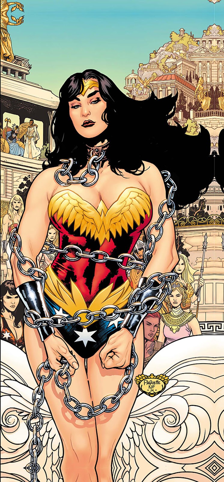
Much – MUCH – better was volume 1 of Grant Morrison’s Wonder Woman: Earth One from earlier in 2016, which provided a new but coherent take on the Amazon’s origin story.

Yanick Paquette’s art worked for me – but then again, I didn’t get in a tizzy about pictures of WW in chains. Well, not that sort of a tizzy.

I really don’t know whether I’ll watch this summer’s film: setting it in WWI as opposed to Wonder Woman’s conventional entry into human affairs in WWII suggests that the filmmakers have decided that, instead of understanding that conflict as six of one and half a dozen of the others, writ large across all the main actors involved, it’s going to leap in with a howlingly simplistic Goodies v Baddies approach.

We shall see.

Normal and the head of Agatha Blue Witch
Very differently, one of my personal discoveries of the year was Andrew MacLean’s Head Lopper.

Written and drawn by MacLean – and originally self-published before being picked up by Image – this is the tale of Viking warrior Norgal, who hunts down monsters with the help (though he doesn’t actually like it) of the severed head of Agatha Blue Witch, which he carries around in a bag.

Image threw the comic convention of monthly, 22-page issues out of the window for this, instead allowing MacLean to produce bigger issues on a quarterly basis.

And while the first trade is a lot heftier a volume than you’d usually expect, it doesn’t fail on the fun quota.

Completely different to Hellboy, it would nonetheless be impossible not to see a relationship between Mike Mignola’s seminal work and this.

There’s humour, violence, great atmosphere and a wonderful sense of the folkloric – yes, all things that you’ll find in Hellboy – along with a superbly stylised visual look, all of which effectively gets the Mignola nod of approval in a contribution from the man himself in the gallery at the back of this volume.

MacLean makes storytelling look simple and his art ticks incalculable numbers of boxes. The picture I’ve used here also illustrates MacLean’s fascinating use of foreshortening and perspective, which is a contributory aspect of the work.

There is not a single thing I don’t love about this.

Black Road comes with added ravens
Not very far behind in my personal appreciation stakes comes the first trade of Black Road, which also plunges readers into Viking terrain – but the mood and look could hardly be more different.

Magnus the Black is a man placed awkwardly somewhere between paganism and Christianity, as the church militant strives to conquer the Viking lands for Christ.

Hoping to perhaps ease the trauma of this momentous change for his fellow Norse men, Black finds himself caught up in the bloody politics of religious conquest – and has to turn detective when an official in his care is brutally murdered.

Brian Wood’s story has a satisfying complexity about it, but it’s the art by Dave McCaig and Garry Brown that really lifts this, with its evocation of the bleak, vast landscape of the north.

Having enjoyed the autumn release of the first trade, I’ve hit the subscribe button for the coming issues in this Image series, rather than wait for trade two.

Actually, that’s also an indicator that I’m getting sussed enough about the comics world that I spotted it before the new arc begins.

In the meantime, Skottie Young’s I Hate Fairyland is another comic that defies easy categorisation.

A bright, bubbly tot called Gertrude wishes to live in Fairyland – and then her wish comes true.

Gertrude is not as happy as Larry. Neither is Larry, to be fair
Unfortunately, 20 years later, she’s grown mentally but is physically still a child, trapped in a bubblegum world of sugary niceness.

A crazy new take on a sort of Dorothy longing for Kansas, Gertrude has become a sweary, psychopathic monster who wants to destroy everything and everyone as she tries to find an escape back to reality, accompanied by Larry, a cynical version of Jiminy Cricket.

Life is further complicated when the queen of Fairyland decides that the only way in which to deal with the chaos and violence is to have Gertrude herself killed.

Written and illustrated by Young, volume one was fun and the second trade is out now (if you look online at Forbidden Planet, it can currently be obtained with a very nice autographed postcard too).

It’s hard to know where Young can take this story – but fluff you (as our less-than-angelic Gertude so often puts it): it’s going to be fun finding out.

And finally, the autumn also saw my own first comic strip – okay, only three pages, but my words and my illustrations. It was published in a membership magazine that went to over a million people, but I've now put up a digital version, so you can catch it here. Enjoy!